The problem
I built Dice & Shrines with five asymmetric guardian characters. Each one has a different passive and active ability that changes how reinforcements distribute, which territories you can attack, and what happens when you take damage.
The question I couldn’t answer from just playing was: are they actually balanced?
Not “do they feel different” — they obviously do. But is Fox’s stored critical actually overpowered? Is Turtle’s loss-recovery passive strong enough to matter, or is it just flavour? Is there a first-mover advantage baked into the map structure?
You can’t answer questions like these from vibes. You need data. So I built a stats service.
What gets recorded
Every game produces five event types, posted as fire-and-forget HTTP calls from the game client to game-stats.hippotion.com/event:
map_generated — logged when the map generator accepts a map. Records territory count, average territory size, minimum size, and how many generation attempts it took. This tells me how often the generator discards its own work and whether the acceptance criteria are too strict.
game_start — fired when a game begins. Captures the number of players, the guardian assigned to each slot, and which slot is human. Returns a gameId that travels with the game for the rest of its life.
attack — fired on every single dice roll. Attacker, defender, from-territory, to-territory, how many dice each side had, what they rolled, who won. This is the raw material for the probability analysis.
elimination — fired when a player is knocked out. Records which guardian they were and how many players remained, so I can tell who exits first and who makes the final stand.
game_end — fired on win or abandon. Records the winner’s guardian, how many turns the game took, and whether it was abandoned.
The service is a FastAPI app backed by PostgreSQL, running in the homelab on the same k3s cluster as the game. About 150 lines of Python plus a schema.sql that the app runs on startup.
The dashboard
The stats dashboard is a single-page HTML response from / — self-contained, no external framework, chart.js for the visualisations. It polls /api/stats every 30 seconds and updates in place.
What it shows:
Overview cards: total games, games today, games this week, human win rate, average turns per game, overall attack win rate, abandoned game count.
Activity charts: games per day (last 7 days), game duration distribution in 10-turn buckets.
Death spiral analysis: when players abandon (broken into phases: instant, early, mid-early, mid, late), and first-mover advantage — win percentage by player slot 0 through 5.
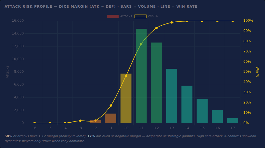
Attack behaviour: the dice margin chart is the most interesting one. It shows attack volume and win rate for every possible attacker-dice-minus-defender-dice value, from strongly negative (attacker is outmatched) to strongly positive. Overlaid: a win rate line. You can see the actual probability curve emerging from real games and compare it to what the math predicts.
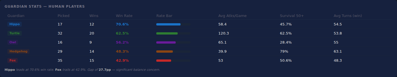
Guardian intelligence: win rate, pick count, average attacks per game, survival rate to turn 50+, and average turns per winning game — per guardian, human players only.
Elimination intelligence: when the first player gets knocked out per game, and a guardian fate table showing average elimination order and first-out percentage. Earliest-exiting guardian is surfaced explicitly.
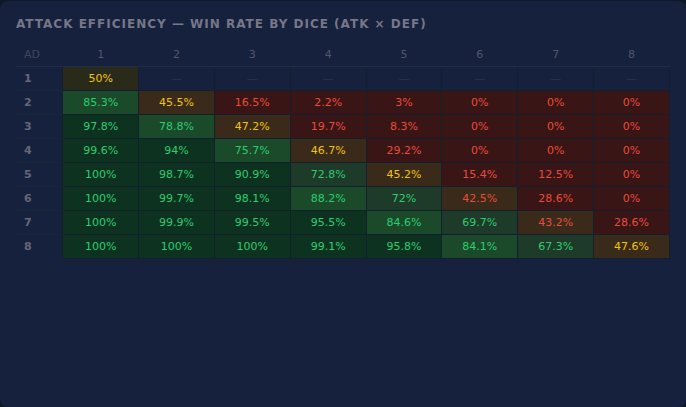
Map influence: territory count versus average game length. Also an attack efficiency heatmap — win rate for every attacker-dice × defender-dice combination, 1 through 8, rendered as a colour grid.

Recent games: last 15 games with the human player’s guardian, result, and IP address so I can tell if it’s me testing or an actual player who wandered in.
What the data showed
The attack win rate across all games sits just under 60%. That’s higher than a naive analysis suggests it should be — if both sides roll fairly, equal dice should be near-even. The explanation is selection bias: players only attack when they have a dice advantage. Nobody sends 2 dice at 8 dice repeatedly. The average attack has a positive margin, so the average win rate is above 50%.
The margin chart made this explicit. The plurality of attacks have a margin of +2 or more. The sub-zero margin attacks — technically losing plays — are a real but small fraction, usually late-game desperation or deliberate tempo plays.
Human vs AI attack quality turned out to be the sharpest comparison. Humans and AI have different average margins. The AI is greedy but disciplined about attack selection; humans sometimes take gambles the AI wouldn’t. You can see it in the numbers.
First-mover advantage is measurable but not massive. Player slot 0 (goes first) has a slightly higher win rate than the average. Slots at the higher end of turn order are somewhat depressed. Not broken, but real — and a useful thing to watch if I ever add a competitive mode.
Guardian balance: the win rate gap between the best and worst guardian tells me whether the balance is within acceptable range or a concern. The dashboard calls it out explicitly: if the gap exceeds 15 percentage points, it flags it as a balance issue. That threshold is arbitrary, but it forces a decision rather than letting drift accumulate unnoticed.
Abandonment phases: most abandonments are instant — the player clicked “new game” before actually playing. The interesting number is mid-game abandonment, which is a proxy for death spirals: you see your income drop, you know you’re losing, you close the tab. That’s a design signal, not just a metric.
Designing for measurement
The useful insight from building this is that it changes how you design the game. Once you know every attack is being logged, you start thinking about what the attack data will tell you. Shrines give territories a guaranteed die — does that show up in attack margins near shrine territories? I didn’t add territory-topology tracking, but I could. The schema is just a few columns away.
The same goes for guardian abilities. Fox’s stored critical fires at turn boundaries — I log turn number on every attack, so I can look for Fox spikes in attack win rate on certain turns. I haven’t run that query yet, but the data is there if the balance question becomes sharp enough to need it.
That’s the thing about adding observability to something you built yourself: you stop guessing about whether it’s working and start reading the evidence. The game got more interesting to design once I could see what was actually happening inside it.
The stack
- FastAPI — event intake and stats API, ~150 lines
- PostgreSQL — five tables: maps, games, game_guardians, attacks, eliminations
- chart.js — dashboard visualisations, loaded from CDN
- k3s + Argo CD — deployed as a Kubernetes pod, Dockerised, managed GitOps alongside everything else on the homelab
Source at dice-n-shrines-stats.